Facebook Rolls Out A New Timeline Layout
- Published in: Social Media
- Written by Allison Solberg
- Permalink
When I woke up this spy software android gratis morning, logged onto to my Facebook account, I quickly spotted a new change.
No more ZIG ZAGS!
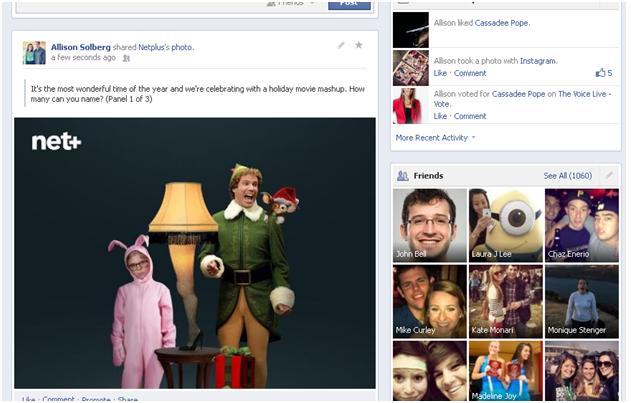
That’s right. Facebook has converted back to their old ways and is testing a new Timeline layout, where you no longer have to zig zag back and forth between posts. All of your statuses, images, and check-ins appear larger and stacked one on top of the other.
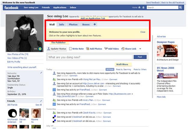
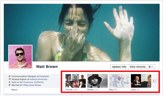
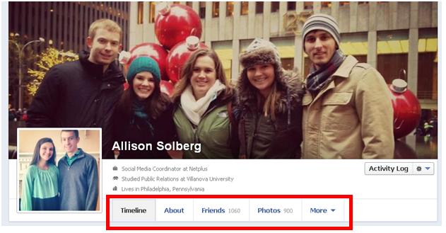
In addition to a change in wall-post appearance and layout, your tabs have changed as well. Instead of boxed tabs with images, they now appear listed along the bottom of your cover photo. Only the top three tabs are shown (About, Friends, & Photos) and the http://mcubedphotos.com/wyhxn/remotely-install-spyware/ additional apps and features appear in a drop-down menu. This is a similar set-up that they had back in 2008.
The only profiles that haven’t made the sms spy with phone number switched yet are Fan Pages. However, it is important to take notes about these new changes. If the new layout is applied to all Fan Pages, your business will need to change the way they post and interact with the community.
Important key notes about the new Timeline layout:
- Your posts are much Much MUCH LARGER! This is the time to think all about…IMAGES! Place a lot of time and effort into choosing and creating the images you post on your profile, because it is most definitely going to grab the most attention (even more than before!)
- Fans no longer see more than one post when first landing on your page. With the elimination of zig zags, fans can only see your most recent post when first visiting your page, and only one at a time after that. This is extremely important because each post must be how can i spy on my girlfriends text messages enticing enough to urge the user to keep scrolling down. Otherwise, you are going to lose their attention and interest after the first two posts.
- Last but certainly not least, the TABS! Before you could rearrange your tabs and choose what you wanted to highlight, this is no longer the case. If this same function is applied to a Timeline layout for Fan Pages, then businesses will not be able to feature their apps and other branded tabs at the forefront of their profile.
If Facebook doesn’t make the switch or has some other trick up their sleeve, then your business may not even need to worry. Nonetheless, whenever there is a new Facebook update, there is always another new opportunity or ability to engage with your community.
Take a look at the images below to see the similarities and differences with past and present Facebook Profile layouts:
Tabs:
2008:
2011:
2012:
Post Layout:
2009 – Stacking
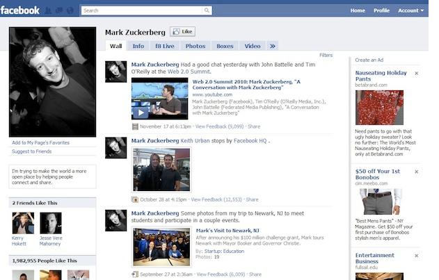
2011 – Zig Zags
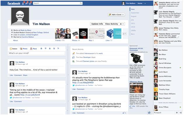
2012 – Stacking…again
